This guide is beginning straight with the Stocks Technical Analysis in Python without Library’s basics acquaintance and introduction.
If you want to learn how to install the EODHD APIs Python Financial Official Library and activate your API key, we recommend to start with exploring of our Documentation for it.
If you are alredy familiar with the first steps and searching for how to get tickers prices (End-of-Day, Intraday and Real-time) directly into the Python environment for the Technical Analysis, then we suggest to explore the guide “Download EOD, Intraday and Real-time prices for any Cryptocurrency with Python simply“
Let’s start by creating ourselves a Pandas dataframe containing Apple daily data.
df = api.get_historical_data("AAPL", "1d")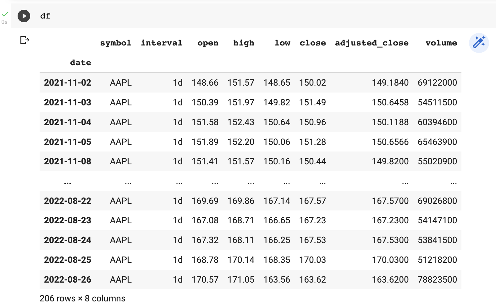
There is this great Python library called “pandas-ta”. It provides many technical indicators and candlestick patterns to use on our data.
First, you will want to install “pandas-ta”.
python3 -m pip install pandas_taThen, we will want to import it as “ta”.
import pandas_ta as taI’ll then apply two moving averages to our data, which will be EMA12 and EMA26. A Simple Moving Average (SMA) is a rolling average of closing prices using a defined period. An Exponential Moving Average (EMA) is similar the Simple Moving Average (SMA) except it’s weighted to give more recent data higher importance.
df["ema12"] = ta.ema(df["close"], length=12, fillna=df.close)
df["ema26"] = ta.ema(df["close"], length=26, fillna=df.close)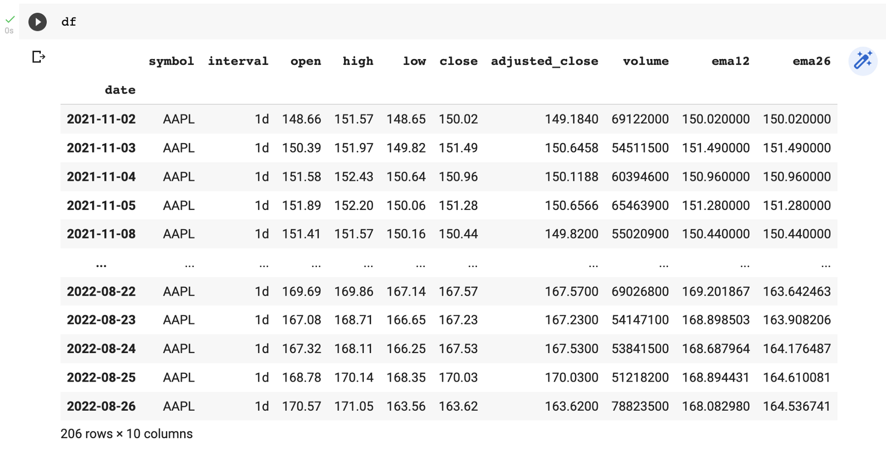
You will see our EMA12 and EMA26 added as new columns. These two moving averages on their own don’t really tell us very much individually. What we are really interested in is when the faster moving average crosses above the slower moving average and visa versa.
This is the code that will do it for us. I’ve included comments to explain what each line does.
# column "ema12gtema26" will be true when "ema12" > "ema26"
df["ema12gtema26"] = df.ema12 > df.ema26

# column "ema12gtema26co" will be true when
# "ema12" crosses above the "ema26"
df["ema12gtema26co"] = df.ema12gtema26.ne(df.ema12gtema26.shift())

# column "ema12gtema26co" will use a default value of 0
df.loc[df["ema12gtema26"] == 0, "ema12gtema26co"] = 0

# column "ema12ltema26" will be true when "ema12" < "ema26"
df["ema12ltema26"] = df.ema12 < df.ema26

# column "ema12ltema26co" will be true when
# "ema12" crosses below the "ema26"
df["ema12ltema26co"] = df.ema12ltema26.ne(df.ema12ltema26.shift())

# column "ema12ltema26" will use a default value of 0
df.loc[df["ema12ltema26"] == 0, "ema12ltema26co"] = 0

# our new columns will be binary 0 or 1 instead of True or False
df["ema12gtema26"] = df["ema12gtema26"].astype(int)
df["ema12gtema26co"] = df["ema12gtema26co"].astype(int)
df["ema12ltema26"] = df["ema12ltema26"].astype(int)
df["ema12ltema26co"] = df["ema12ltema26co"].astype(int)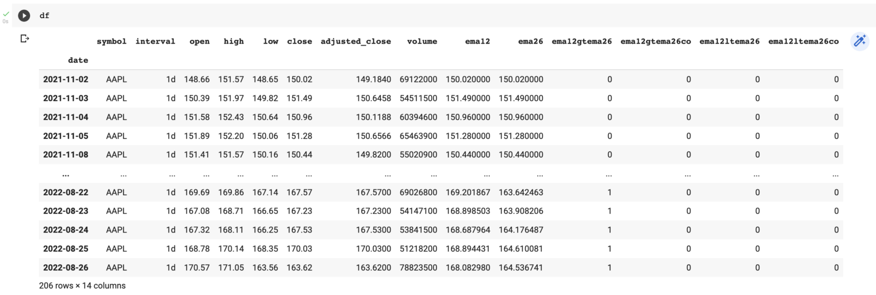
Over our 206 days of data when would be our buy and sell signals?
buysignals = df[df["ema12gtema26co"] == 1]
sellsignals = df[df["ema12ltema26co"] == 1]
This will create two new dataframes. One called “buysignals” which will contain all the buy signals, and one called “sellsignals” which will contain all the sell signals.
buysignals[["symbol", "interval", "open", "high", "low", "close", "adjusted_close", "volume"]]
This example I am showing you is basic and only looks at the cross-overs of EMA12 and EMA26. You could make your strategy more advanced buy incorporating MACD/Signal, RSI, or any of the other options.
I encourage you to try this yourself, but I’ll give you a few hints.
To add “macd” and “signal” to your dataframe you would do this.
df_macd = ta.macd(df["close"], slow=12, fast=26, fillna=0)
df_macd.fillna(0, inplace=True)
df_macd.columns = ['macd','histogram','signal']
df["macd"] = df_macd['macd']
df["signal"] = df_macd['signal']
Your challenge is to identify the cross-overs as I did above. Once you have done what you will want to incorporate it into our buy and sell signals. You can do it like this.
buysignals = df[(df['ema12gtema26co'] == 1) & (df['macdgtsignal'] == 1 )]
sellsignals = df[(df['ema12ltema26co'] == 1) & (df['macdltsignal'] == 1 )]
This is saying a buy signal is when the EMA12 crosses above the EMA26 AND the MACD is higher than the Signal (note not crossing over, higher than). A sell signal is when the EMA12 crosses below the EMA26 AND the MACD is lower than than the Signal.
Graphing this will make it a lot easier to visualise and understand. We will want to install a graphing library called “matplotlib”.
python3 -m pip install matplotlibAnd import it as follows.
import matplotlib.pyplot as plt
import matplotlib.ticker as ticker
Let’s create a nice graph to visualise the EMA12 and EMA26 cross-overs.
plt.figure(figsize=(30, 10))
plt.title("EMA12 EMA26 Crossovers")
plt.plot(df['close'], label="price", color="black")
plt.plot(df.ema12, label="ema12", color="orange")
plt.plot(df.ema26, label="ema26", color="purple")
plt.ylabel("Price")
plt.xticks(rotation=90)
plt.tight_layout()
plt.legend()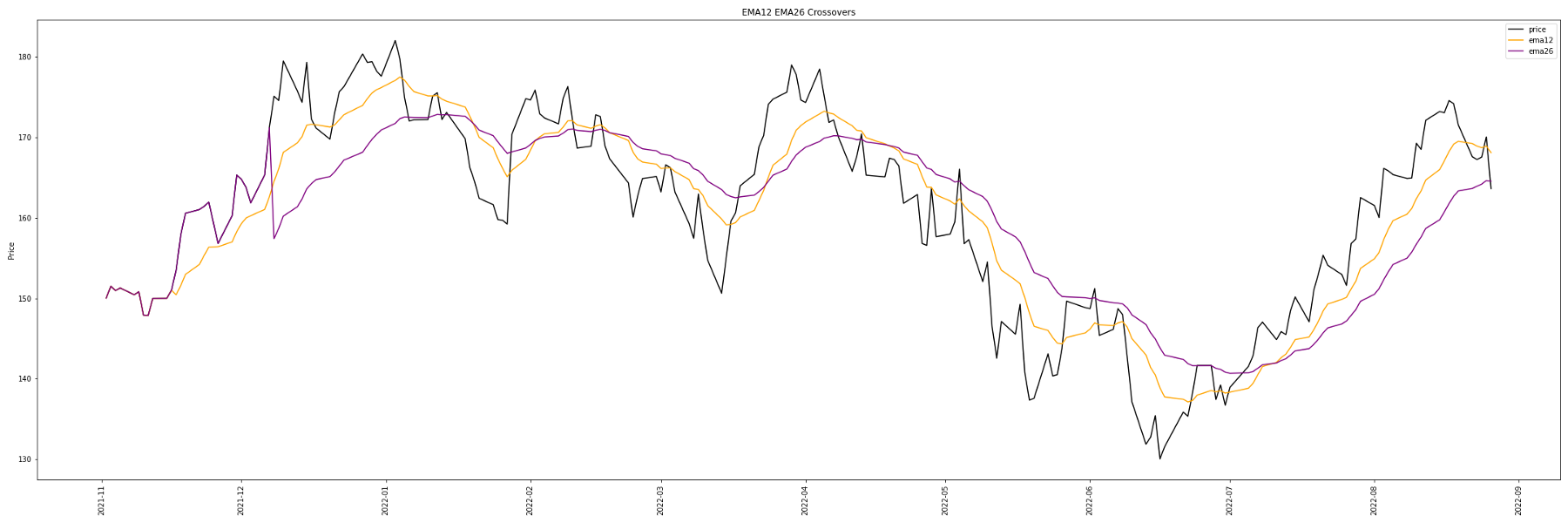
EMA12 is orange, EMA26 is purple, and the closing price is black. You will notice every time the orange line crosses above the purple line the price increases and when the orange line crosses below the purple line the price decreases.
If you would like to save your graph you can do this.
plt.savefig("ema1226.png")If you are using Google Colab you can download your file like this.
from google.colab import files
files.download("ema1226.png")
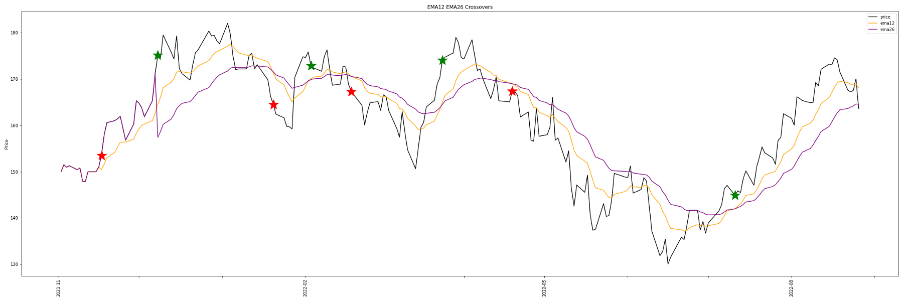
Wouldn’t it be nice if if we could visualise our buy signals more easily? Especially if we have a more advanced strategy.
Try this out…
buysignals = df[df["ema12gtema26co"] == 1]
sellsignals = df[df["ema12ltema26co"] == 1]

plt.figure(figsize=(30, 10))
plt.title("EMA12 EMA26 Crossovers")
plt.plot(df['close'], label="price", color="black")
plt.plot(df.ema12, label="ema12", color="orange")
plt.plot(df.ema26, label="ema26", color="purple")
plt.ylabel("Price")
plt.xticks(rotation=90)

for idx in buysignals.index.tolist():
  plt.plot(
      idx,
      df.loc[idx]["close"],
      "g*",
      markersize=25
  )

for idx in sellsignals.index.tolist():
  plt.plot(
      idx,
      df.loc[idx]["close"],
      "r*",
      markersize=25
  )

ax = plt.gca()
for index, label in enumerate(ax.xaxis.get_ticklabels()):
  if index % 3 != 0:
    label.set_visible(False)

plt.tight_layout()
plt.legend()
You will see at the top I’m creating my two dataframes containing the buy and sell signals.
I then iterate through my buy and sell signal dataframes and plot a green star for a buy signal and a red star for a sell signal.
The “gca” code is optional special code to label the x-axis in a cleaner way.
I hope you found this article about Stocks Technical Analysis in Python interesting and useful.


